CDent
Thursday, 1 May 2014
Uploading COTV
we uploaded COTV and starting sharing the youtube link through social media sites to gain attention, the video is currently on roughly 5000 views and we have been asked I we Can feature in a local newspaper article due to the reception we have received. http://m.youtube.com/watch?v=G2CSqGdouPg
Green screens
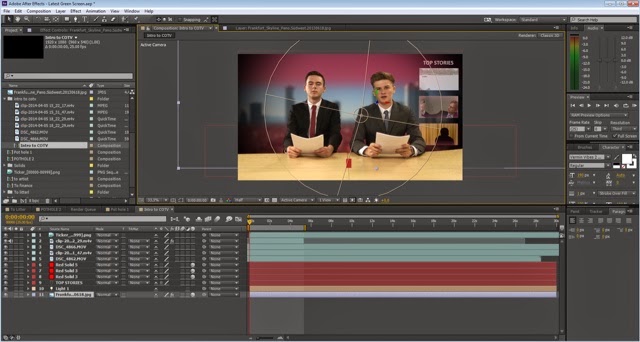
Finally I transferred the green screen shots to after effects using the Adobe intergration network, I then use the keylight effect again to replace the green screen with a cityscape background. I then added two feathered pink boxes around the cityscape to create a window effect. I still felt as though there was something missing so I watched a news report and noticed that the lighting is similar to a spotlight, so I added a light on after effects and gave it a spotlight style, this added a shade around the news desk and window which looked more realistic.
COTV feed
After making a rough cut I wanted to create the complete news feel by adding an animated feed with tickers and the logo of the news. So I firstly created a spinning logo, again using element 3D to create a disk style object with COTV engraved on it as it constantly spins throughout the duration. I then created the feed which would also be running throuout, this featured constant bulletins and tickers which introduced the subject. I animated different sized boxes to give the effect of the tickers and also used 2 expressions, one for the time which began at 10 and rose throughout, also an expression to make the bulletins continuously scroll across the bottom of the screen.
Editing COTV
COTV
Recently a few of my mates have made a youtube hit which got 10,000 views in a few days, which is a comedy based on the hometown we live in and manged to get in the local paper and on the radio. I have been asked to edit the second installment of the series I parodies, the theme will be a news programme called Crawley Online TV which means it will most likely need effects such as chroma keying.
Editing Swipe
The group have recently finished shooting swipe which was a success. I am splitting the edit with Al, in which he will do the jumping scenes and I will do the character customising scenes. For this interface I went for a layout which was widely used in RPGs such as GTA. I have the character (Ethan) on the right with the selection menu on the left. I have times the animations of the menu so that when the "gamer" presses a specific item e.g. T-shirt, Ethan will leave the room and imediately re enter the room wearing that item. The menu and interface uses simple animations however due to the amount of interaction I wanted the interface to look as though it had, this did take some time. After this I then combined the vfx Al had done, with mine, added sound, transitions, start menu and credits then it was ready for the export. I edited the range of ambient sounds so they would match the locations.
Subscribe to:
Posts (Atom)


